case study
La Pause Café
More of my work
Project details
- Date — 01/10/2022
- Client — David Thomas
- Project — La Pause Café
What was required
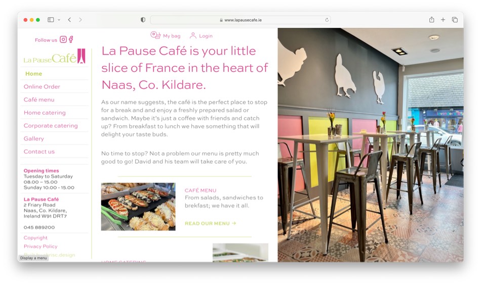
A local coffee shop in Naas, VDC@Home was taken over by its longtime manager to become La Pause Café. The owner, a Breton wanted to retain French character of the business and this in turn helped develop the brand. A fully fledged website with the ability to order cafe menu item was the main focus of this project but graphic design elements ran in parallel
Tools used
- Adobe Illustrator
- Adobe Indesign
- Sketch
- Wordpress
- Woocommerce
Brand development
Project insight
Logo development
This was very much led the signage chosen by the proprietor. Set in Americana, a very open serifed typeface “La Pause Café” the word ‘café’ formed the nucleus of the new logo. To add interest a ligature of the capital C and lower a where joined while overall given more weight considered new curves of the typeface while still maintaining the original feel.

“La pause” is French to take a break but can also be interpreted as pausing; pausing to have a coffee, meet friends or have a bite to eat. These all part of the café culture. The classic icon of two parallel vertical bars that its universally recognisable as the pause button. Hidden space in a logo can be a very powerful way to introduce an element that has meaning. Just look for articles about the Federal Express logo and you will never, ever un-see what is described.

You think of French café, you think of a Parisian sidewalk with table and chairs filled with chic locals sipping expresso and nibbling on delicate pastries. The use of the Eiffel Tower become the focal point of the pause button. By using the outline of this iconic land mark overlaid on the pause element could still be maintained while adding a very French feel. The colours of rose pink and and pistachio green reflect that delicate French dessert, the macaroon. A secondary mid-grey complimented these two colours to formalise the brand.
A number of print items were developed, namely a café menu as well as a catering menu, part of the cafés service and a corporate menu. Coupled with business cards, letterhead and invoices the brand was enforced throughout which could then be translated through to the website. Americana was used for headings and complimented with Sweet Sans for body copy. It’s available in multiple weights so a rhythmic typography standard could be developed. Both fonts are available as their web counterparts.

Website
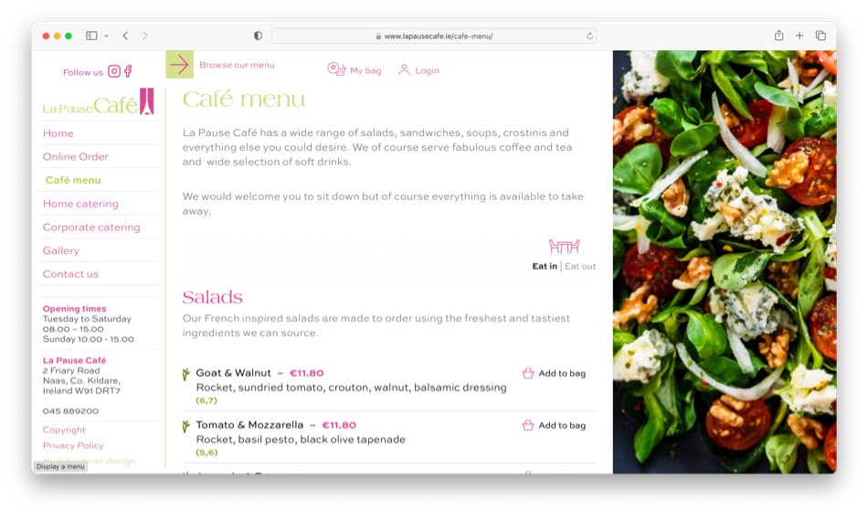
As with all my projects a new mobile first website was designed using WordPress and Woocommerce as the platform of choice. Advanced Custom Fields (ACF) enabled custom sections of the site so food menus could be built easily and controlled. A left hand side vertical navigation enables a fixed position with opening times also visible which is crucial for a café; customers like to know when they can get their cup of Joe. From here a customer can access the various menus. Both the café and corporate menus are available to order online; Woocommerce is the driving force as it is very easy to build new products and customise and payments are taken with the stripe.com gateway.
how can i help?
With 20 years of experience, I can offer you a full range of services from complete web design, brand development and management to social media. Need to start selling online; that’s no problem. Do you need an email marketing strategy, I can help with that.


