case study
How hashtag GreenBlades become a brand
More of my work
Project details
- Client — Rowing Ireland
- Project — Brand development to support Irish rowers
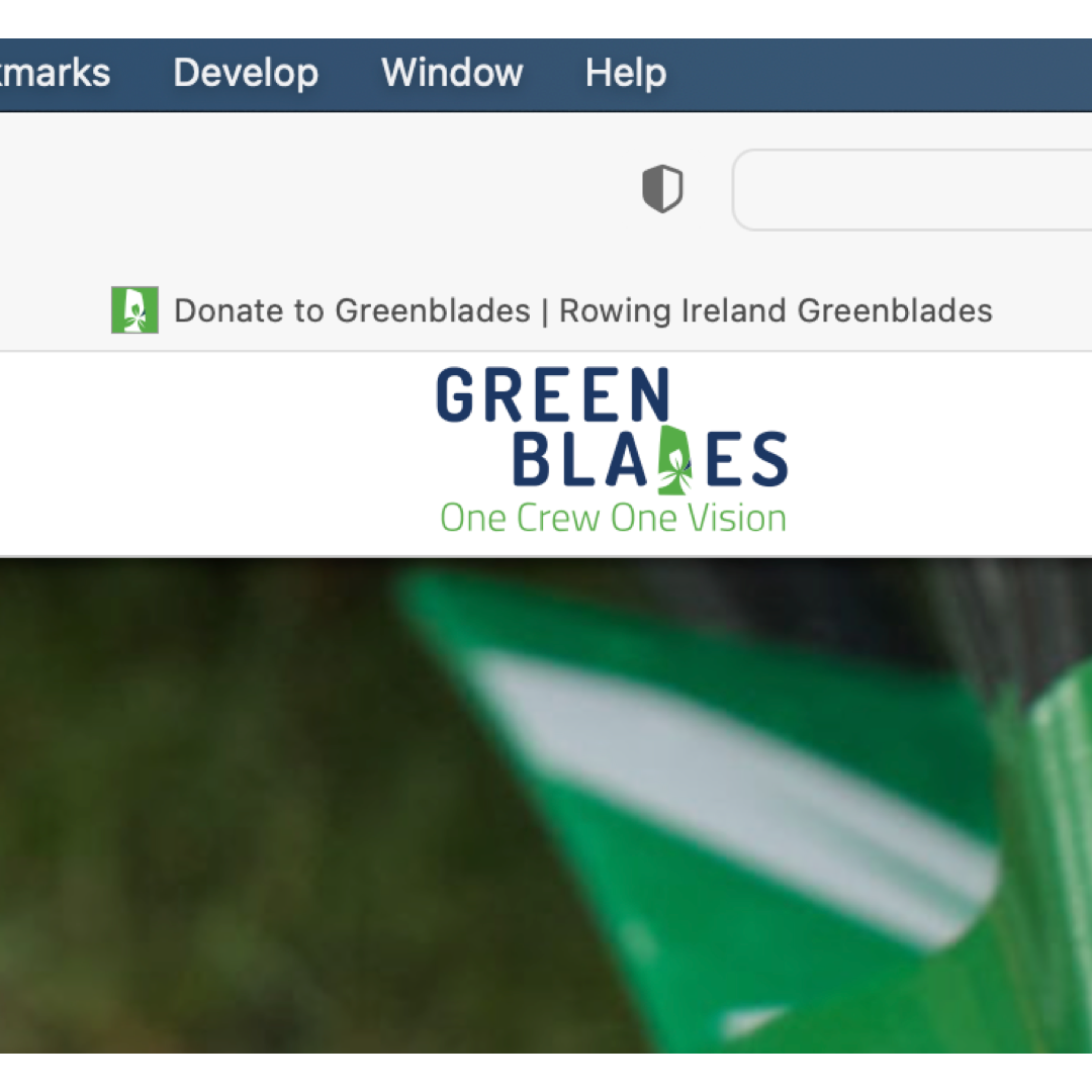
- URL — www.greenblades.ie
What was required
Rowing Ireland, the national governing body for the sport, required a brand that they could use to promote their high-performance and developmental athletes. The support would help fund camps and equipment and promote the sport.
Tools used
- Adobe Illustrator
- Adobe Indesign
Logo development

Project insight
The blade of Rowing Ireland oars had been painted green with a cutout of the logo in white overlaid. It’s very distinguishable and represents the All-Ireland nature of the sport. Used across competitions, the ‘greenblades’ have become eponymous with the Irish squad.
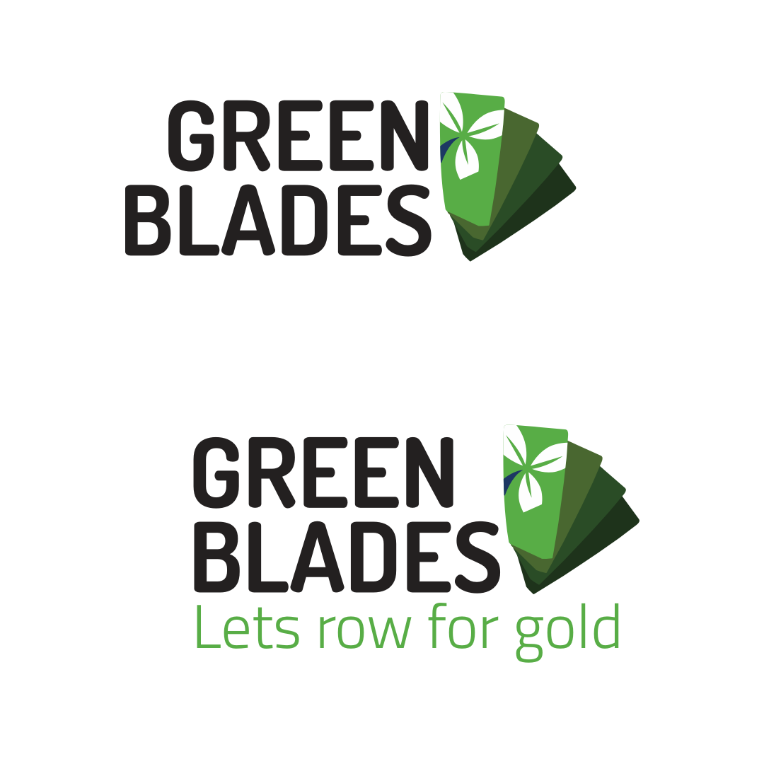
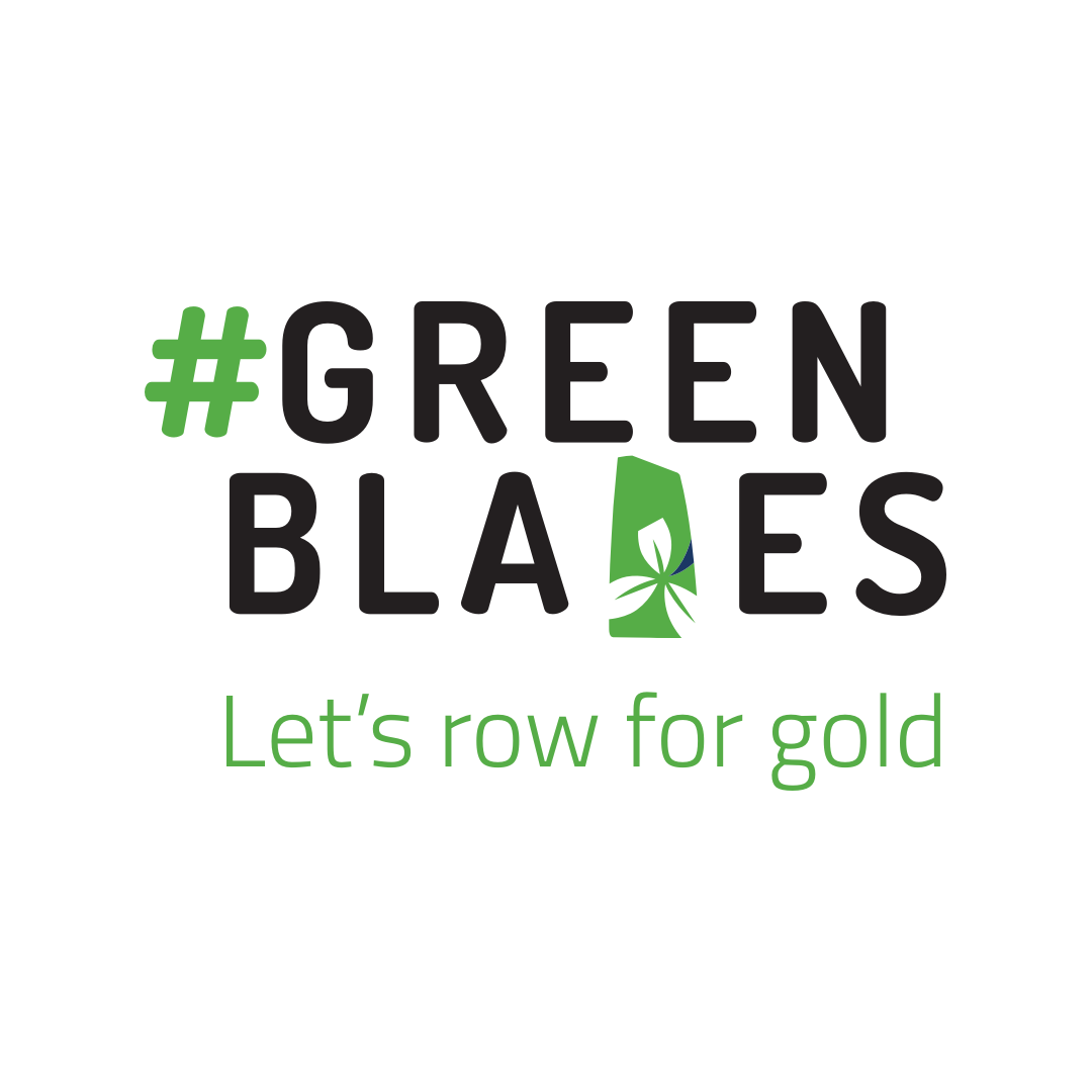
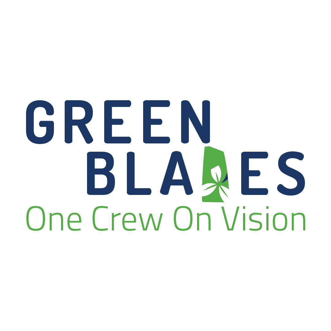
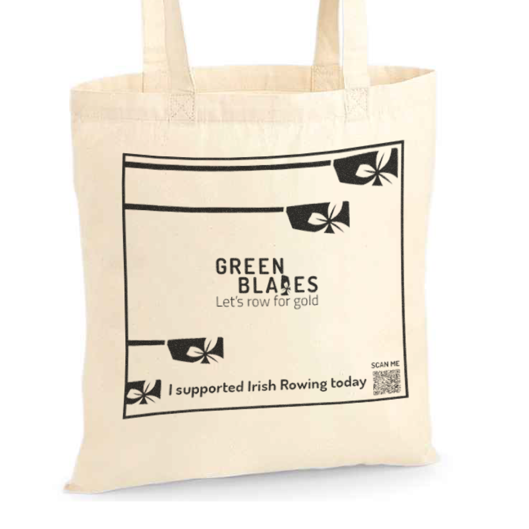
The logo was developed using this green blade by replacing the uppercase d; still readable but introduces the oar blade. The tagline, ‘One crew, one vision’ exemplifies the true nature of what it means to row. For a boat to go fast, every crew member must be in harmony to fulfil the goal of crossing the line first.
Google’s Dosis typeface was chosen for its modern, clean lines and could be used in print and online environments. The green and blue used in the Rowing Ireland logo tie the Greenblades brand together.
The brand has been extended to a website selling branded merchandise, collecting donations, and using printed materials such as brochures, business cards, and even tote bags.
how can i help?
With 20 years of experience, I can offer you a full range of services from complete web design, brand development and management to social media. Need to start selling online; that’s no problem. Do you need an email marketing strategy, I can help with that.
