case study
Start Rowing brand development
More of my work
Project details
- Date — 15/07/2015
- Client — Rowing Ireland
- Project — Start Rowing
What was required
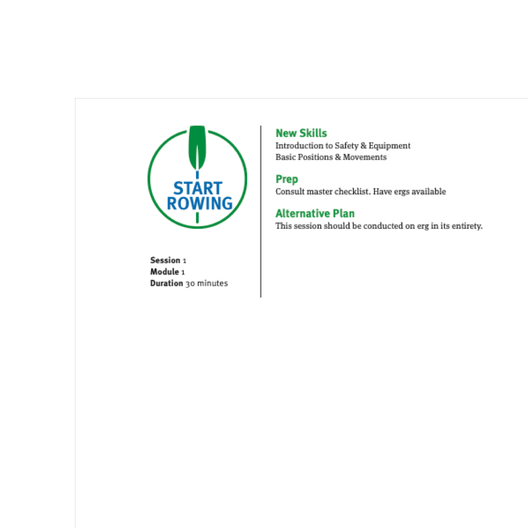
The brief required a logo for a beginners course in rowing that was robust enough to be used in a variety of situations ranging from printed matter to embroidered on a garment. Parallel to this, course material that could be easily downloaded and printed.
Tools used
- Adobe Illustrator
- Adobe Indesign
- Adobe Photoshop
- Photography
Logo development
Project insight
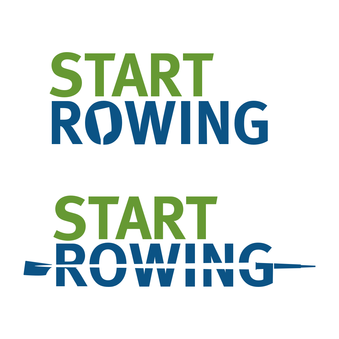
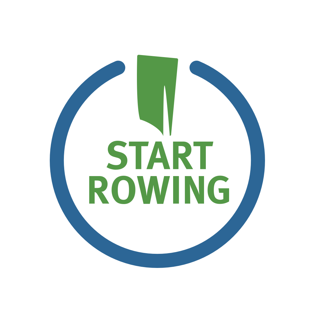
A natural starting point for the logo was an oar. It’s instantly recognisable for many and provided a solid basis to the logo. The concept then looked at the classic ‘start’ or power on icon of a circle that had a downward stroke overlaid. From there the logo evolved with this element using an oar facing downwards. Initially a modern blade was used but felt it might be too niche. Switching to a classic version brought a a more familiar feel, something more recognisable to the new comer. The green and blue palette tied in Rowing Ireland who were the main sponsors.
The course itself was written over 12 modules by an external author and added to a typographically driven layout. The brief required that minimal colours used so as to allow easy home printing. Black was predominately used with minimal amounts of green for headers. By forging coloured backgrounds and no edge-to-edge elements the resulting modules supplied as PDFs a new rower could easily download and print.
how can i help?
With 20 years of experience, I can offer you a full range of services from complete web design, brand development and management to social media. Need to start selling online; that’s no problem. Do you need an email marketing strategy, I can help with that.
